
The Comic Rack Is a Thumbnail

I’m always trying to gauge how readers and buyers respond to artists and I have developed my own strategy for variants because I want them to be of value. I don’t just mean value to a collector, I also consider the artist and how they fit a campaign or branding. Rather than hitting a potential backer with a bunch of variants or by jumping in on existing lanes where the same artists are popping up across multiple campaigns, I started curating themes. A kind of “something for everyone,” mentality. This is built directly into Voltessa Masquerade of the Macabre. There are ultimately going to be 8 variants and each serves a purpose as does the main cover - the only cover that will carry over to the next campaign illustrated by the interior artist, my friend Antonio Brandao.
This entire philosophy is built directly into Voltessa: Masquerade of the Macabre, which launches on Kickstarter Soon. Every cover in the campaign was chosen with a very specific purpose in mind — not just as a collectible, but as part of the larger identity of the book itself.
If you want to follow the launch, you can sign up to be notified right here and join the 240+ readers already following the campaign.

I talk to a lot of great artists and sometimes they approach me looking for work. I might love their work, but I honestly have to gauge correctly if that cover will be worth the investment. A completely impersonal transaction has to take place if I’m thinking about the reader’s taste above my own. First hard lesson - just because I personally like the art doesn’t mean it will resonate with the audience. And on the flip side, if I’m not a fan of the style I can’t let that cloud my judgement on how well it will do in a campaign. I have paid for a covers I loved that did not excite the audience and some of them have lost money. The reality is, especially with comics under the Bleeding Pup and Spicy Pulp banners, not every artist is a good fit even if they are in the same lane. It isn’t the NSFW content or when I decide to do crazy shit, it is the perception and how the characters are represented.
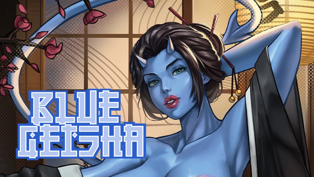
With the Pulp books I shifted toward branding, more specifically the kind of strong visual identity Marvel books had in the 70s and 80s. That heavily influenced the entire Voltessa concept, which was built around the standalone issue mentality from that time. Character-driven stories where a reader could pick up any issue and jump right into an adventure. There’s always a hook and that was reinforced on the covers. A lot of this was a no brainer situation. Creatively, I’m looking at Kickstarter the way you would a comic rack in a store. What makes a tiny thumbnail stop a person from scrolling. Easy if you’re doing a G.I. Joe Omnibus. Fairly easy for a book like Blue Geisha. Not so easy if you do not have the kind of project that can be distilled into a single small rectangular image.

This is where I’m struggling with a comic I’m writing for my own entertainment. Yes, I do that. Not everything gets out of the office. However, I want to do this comic, but it comes with unique challenges and paramount among them is making money to sustain a collection or three.
The concept absolutely has to have the strongest covers possible and that’s where things get tricky and most likely expensive. Also, variants for a comic like this will face the same problem I had with Standstill. The main covers for that series were very strong and had a signature look, but the variant pool is almost nonexistent. I have a very clear vision of what the covers should look like, but not who can provide them.
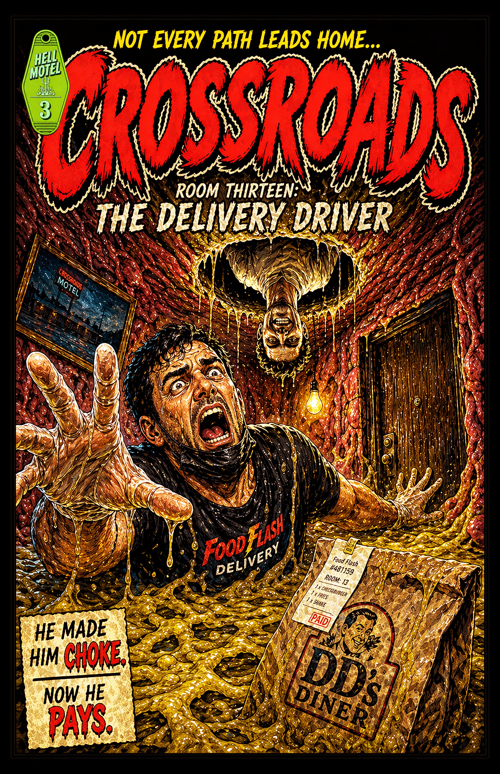
This is a very clear and dynamic example of the kind of cover imagery that can invoke an immediate response. There is no mistaking what’s happening here.
That’s the challenge.
Some concepts can be reduced to a single striking image almost instantly. Others rely on tone, pacing, character or atmosphere and those are much harder to sell in a thumbnail.
That’s also why I’ve become increasingly selective about covers and variants. At a certain point they stop being “extras” and become part of the storytelling itself. The wrong cover can misrepresent a book just as easily as the right one can define it.
Especially now, when most readers first encounter a comic as a tiny rectangle while scrolling past a hundred others.
Next week’s post will explore where Voltessa is heading as a character and why I built the series around self-contained stories instead of traditional ongoing continuity.